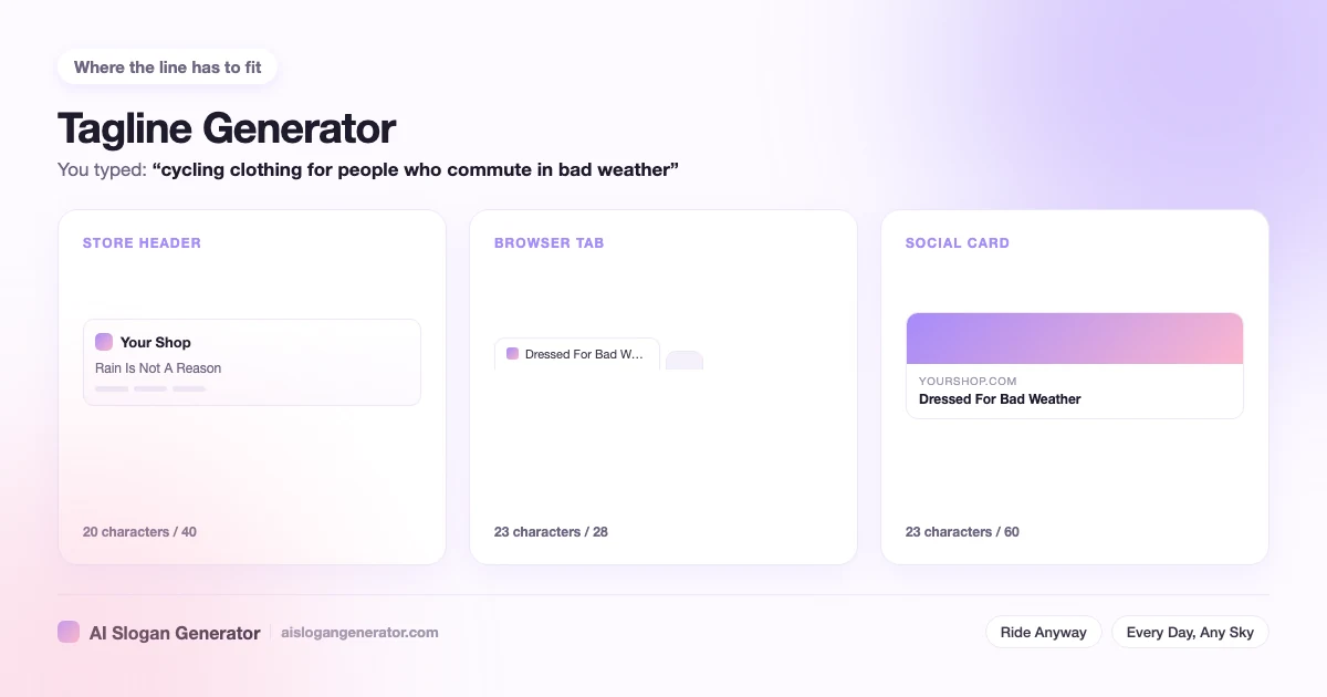
A tagline generator is answering a different question from a slogan tool. A slogan can run for one season and then be replaced. A tagline is the line that sits beside your name on the site, the invoice, the packaging and the sign, so replacing it means replacing all of those at once. The test is not whether the line reads well today. The test is whether it is still true after the product line changes, the price changes and the place you sell changes. This page gives the word count that survives logo size, the four things that date a line, and how the name and the line divide the work between them.
What is a tagline, and how is it different from a slogan?
A tagline is the permanent line beside a brand name. A slogan is written for a campaign or a single product and is expected to be replaced. Same craft, different lifespan, and the lifespan changes every decision you make about the line.
The difference shows up in how each one gets approved. A slogan is signed off because somebody liked it in a meeting. A tagline has to be read by the person who will still be paying to print it in four years, and that person asks a duller question: what happens to this line when the catalogue looks nothing like it does now.
I treat the two as separate jobs with separate shortlists. A campaign line can gamble, because its downside is a season. A tagline cannot, because its downside is a rebrand. If you are writing the gambling kind, the slogan generator covers length, style and trademarks for any business.
How long does a tagline stay in use?
Years, and that is the design constraint. A tagline outlives the campaign that introduced it and usually outlives the product that was current when it was written. Most businesses change it only when the business itself changes direction.
There are three moments when changing it is right rather than restless. The business moves into a category the line excludes. The line starts describing something you no longer do. Or the words have been overtaken outside your control, which happens to anything built on the name of a technology.
Everything else is boredom. You will be tired of the line long before most of your customers have read it once, and that gap is the most common reason a good tagline gets thrown away.
Where does a tagline sit next to a logo?
Under the name or to the right of it, set smaller, with clear space between the two so they read as one unit. That pairing is usually called a lockup. Inside it the line has one job, which is to stay legible at the smallest size the logo is ever printed.
Two positions work and the rest fight the name. Set the line under the name, aligned to its left edge, at roughly a third of its size. Or set it to the right, vertically centred, with a gap wide enough that nobody reads the two as a single phrase. Both survive being shrunk into a corner.
What breaks is small sizes. A line that looked balanced in a document is the first thing to turn into a grey smudge on a tab icon, a stamped label or an embroidered chest patch. Before you commit, shrink the lockup until the name is only just readable, then check whether the line is still a line or has become texture.
This is also why punctuation inside a tagline is a liability in a lockup. A comma or a colon survives at full size and vanishes at small ones, and a line that depends on it reads as two unrelated words.
How many words should a tagline be?
Two to five words, and under about 30 characters if it is going into a logo lockup. The limit is size rather than style. A line set under a brand name renders smaller than the name, so every extra word costs legibility on a phone and on anything printed small.
Word count and character count disagree, and the character count is the one the lockup measures. Three long words can run past 30 characters while five short ones sit comfortably under it. These are the bands I write to:
- One word, under 12 characters. Works only when the word is unusual enough to carry a whole position on its own. Fails by being a description anybody could claim.
- Two to three words, 12 to 22 characters. The band most lockups want. Short enough for a tab, a label and a stamp, long enough to say one thing properly.
- Four to five words, 22 to 32 characters. Room for a contrast or a small turn. Safe under a name on screen, tight on anything printed small.
- Six words or more, over 32 characters. Reads as a sentence rather than a line. Fine in a footer or on an about page, wrong in a lockup.
If a line only works at six words, that is usually a sign it is carrying two ideas. Cut the weaker one and the count takes care of itself.
What makes a tagline age badly?
Four things date a line faster than anything else: a technology, a price, a channel and a trend. Each one sounds current in the week it is written. Each one dates on a schedule you do not control, and the line is still on the packaging after it has.
- A technology. Naming the current platform, format or device dates the line the moment the next one arrives, and it dates it in public.
- A price. Any number, any currency, any version of cheapest. Prices move and the line stays printed.
- A channel. Naming where you sell ties the line to one shop window, and it looks small the day you add a second one.
- A trend in the wording. The vocabulary of a given year reads as that year forever. This is the hardest fault to catch, because the words feel ordinary while you are writing them.
There is a fifth that only shows up later: a line built on being new. New is a claim with an expiry date, and it expires without anyone telling you. A line about what you do rather than when you started has no expiry.
Should a tagline say what you sell?
Only if the name does not. A tagline earns its space by adding what the name leaves out. So a name that already states the category wants a line about the difference, and an abstract name wants a line about the category.
Read the name and the line together, out loud, as one unit. If the pair says one thing twice, the line is wasted and the slot would be better left empty. If the pair says the category and then the difference, in either order, it is doing its job.
A name that gives nothing away needs the category in the line, because a reader who cannot tell what you sell will not stay to find out. A name that states the category outright should spend the line on the reason to choose you instead. If you are still deciding which kind of line you are writing, the difference between a slogan and a tagline is set out in full on the main tool page.
Does a website tagline need to be different from a business tagline?
Usually not, and running two of them is a mistake. A website tagline and a business tagline are the same line in two places. The only real difference is the room, because a site header and a browser tab cut the line shorter than a sign or a letterhead does.
On a site the line turns up in four places and each one cuts it differently. The header beside the name, the hero section under the main heading, the footer, and the browser tab where the business name usually eats most of the room. A company tagline that fits the header fits the other three without being rewritten, which is the argument for writing to the tightest slot first.
What does change between a sign and a site is what sits around the line. On a storefront the tagline competes with product photos and a button, so the same words carry less weight than they do on a letterhead. If the line is going on a store specifically, the Shopify slogan generator has the character budget for every slot in a theme.
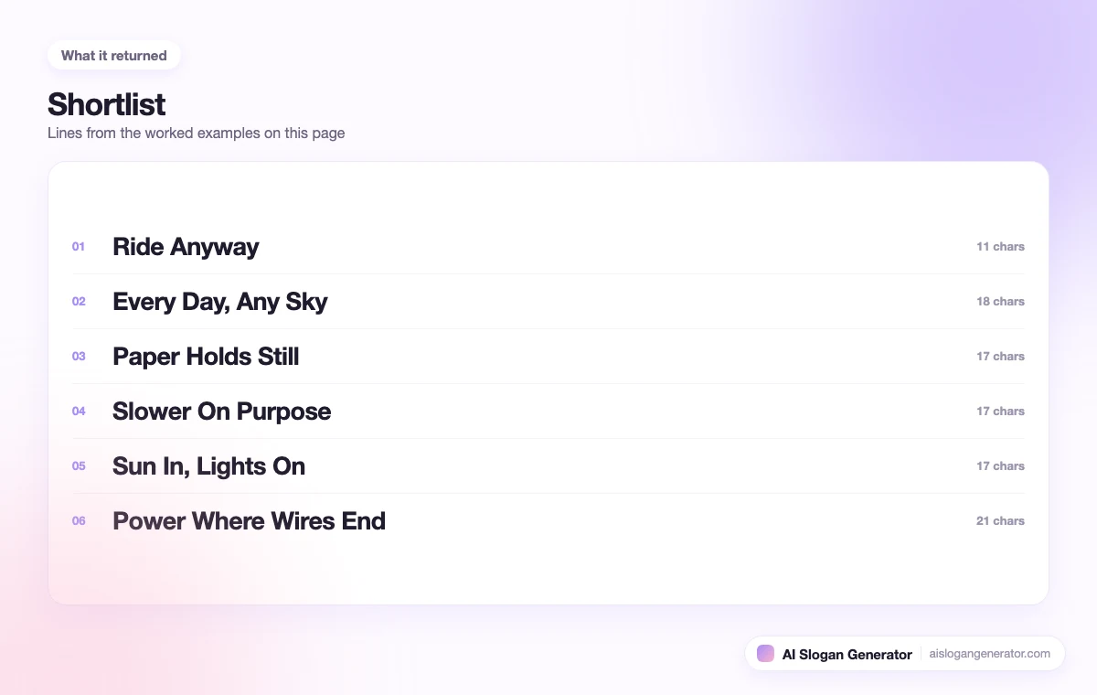
A tagline maker earns its place here because it hands you a shortlist rather than one answer. Reading six candidates at header width tells you more about which one survives than any amount of deciding in a document does.