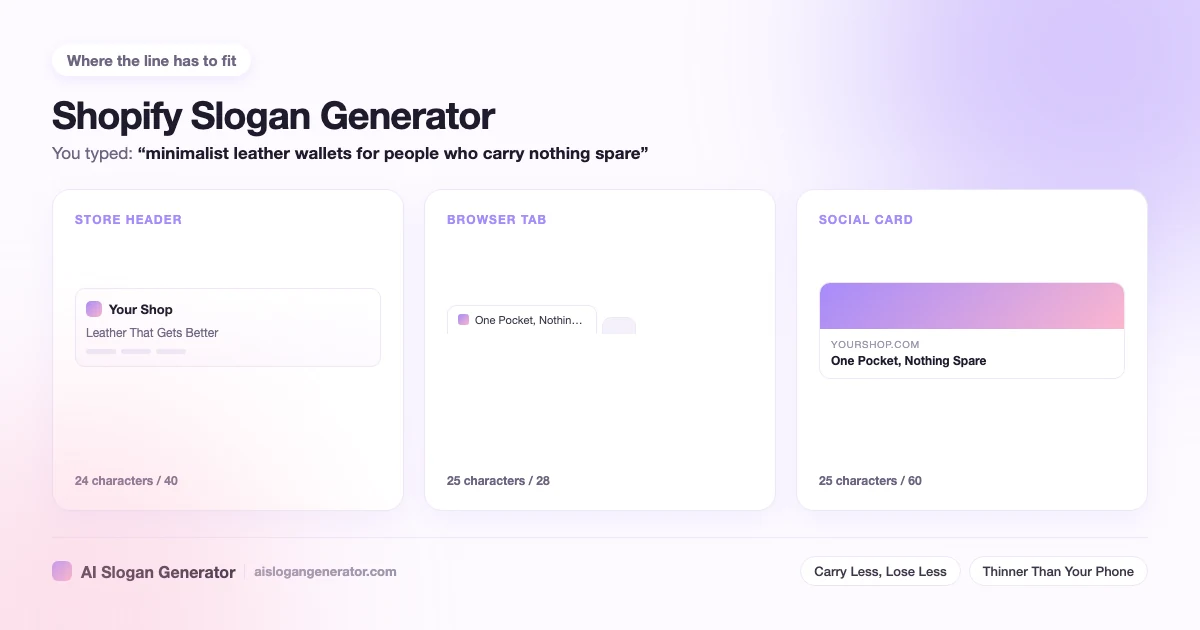
A Shopify slogan generator has one job the general tools skip: the line it hands you has to fit a theme. A storefront decides the length for you. The announcement bar, the header beside the logo, the hero section, the browser tab and the share card each cut the line at a different point, and a line written without knowing which slot it is for gets rewritten twice. This page gives the budget for each slot, how the store name and the line sit together in a search result, and which styles hold up above a product grid.
Where does a slogan actually appear in a Shopify store?
In five places, and they are not equally forgiving. The announcement bar, the header area beside your logo, the hero section at the top of the home page, the footer, and the browser tab title the theme builds from your store name. A share card makes six the moment somebody posts a link.
Each slot cuts the line at a different point, which is why one slogan can look right in two of them and broken in the other three. These are the budgets I write to:
- Announcement bar, about 60 characters. The widest text slot most themes give you, and the one most shops spend on a slogan when it could be carrying a shipping threshold.
- Header beside the logo, about 40 characters. Looks generous on a laptop and is the first thing to break on a phone.
- Hero section, about 70 characters. It sits as a subheading under the main heading, so there is room, but the line is competing with a button.
- Footer, about 80 characters. Nobody reads it closely, so a long line is safe there and does almost nothing.
- Browser tab, about 28 characters including the store name. The name eats most of that, which is the whole problem with putting the line in the title tag.
- Share card, about 60 characters. Read by someone who has never seen your shop, so this is the slot where a plain line beats a clever one.
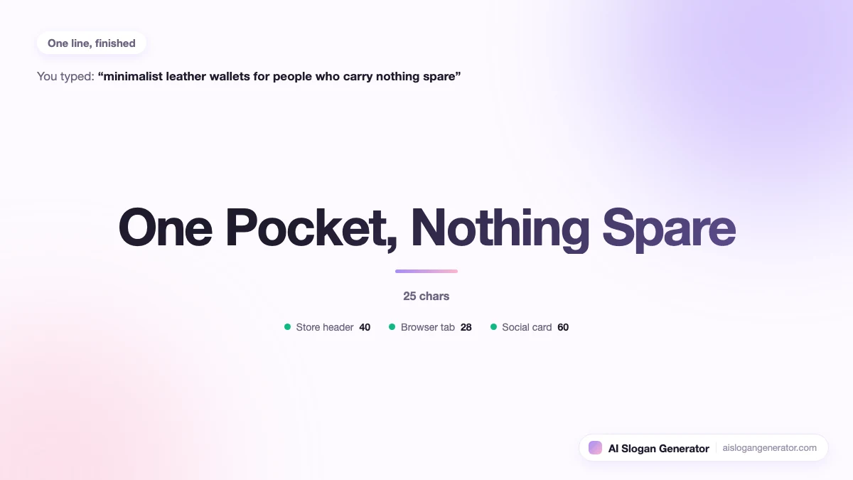
Write to the header first. At 40 characters the line survives the hero section, the footer and the share card untouched, and the only slot it still fails is the tab, which it should not be in anyway.
How many characters fit in a Shopify theme header before it wraps?
About 40 on a desktop header. The same line is the first thing to break on a phone, because most themes set header text in a column narrower than the screen. On a narrow phone the usable budget is closer to 30 characters.
Wrapping turns one thought into two fragments stacked on each other, and the second fragment reads as a mistake rather than as a second half. That is why I treat a line that wraps on a phone as worse than no line at all. A visitor reads the break as broken code.
Two things make 40 characters go further. Short words, which is obvious. Less obviously, a comma: a line with a break point in the middle wraps where you chose rather than wherever the word boundary happens to fall, so it still reads as one line in two parts.
Count characters, not words. Four long words can run past 40 while six short ones sit comfortably under it, and the only number that matters is the one the theme is measuring.
How should the store name and the slogan sit together in a search result?
As two halves of one sentence, not two claims competing for the same space. A search result shows your store name and your page title together, so the line has to say what the name does not. If the name already gives the category, the line gives the difference.
The common failure is a shop called Northfield Leather Goods running a line about quality leather goods. Read together they say the same thing twice and spend the whole result on one idea. Northfield Leather Goods beside Thinner Than Your Phone says two things, and the second is the one somebody clicks.
The same test applies on the browser tab, where the store name usually comes first and whatever survives the truncation is yours. Open your own shop in a new tab and watch how far the text gets before the ellipsis. That is the real budget, and it is smaller than the editor makes it look.
I would write the line assuming the name has already been read. It is a second sentence, not an introduction.
Does a Shopify slogan belong in the title tag?
Usually not. A title tag has roughly 60 characters of useful room and the store name takes a share of it, so a slogan in there is competing with the words a buyer actually typed. Put the product language in the title and keep the line on the page.
There is one case where it earns the slot. When the store name is abstract and gives no clue what you sell, a short line doing the explaining beats a name on its own, because a result nobody understands is not worth the characters it saves.
Even then, keep the two jobs separate in your head. The title is answering a search. The line in the header is answering the question a visitor asks once they have arrived, which is a different question with a different answer. The general rules for length and style across every surface sit on the slogan generator page.
Which slogan style sells on a product-led storefront?
Plain and bold, most of the time. A storefront visitor is one click from a product page and is deciding whether to take that click, so the line has to say what the shop is or why this shop. Playful and elegant lines work better once the shop is already known.
The reason is the position. On a Shopify home page the line sits directly above the first products a visitor sees, so it is doing the job a category heading does elsewhere. A line that needs a second read loses to the product photo underneath it.
- Plain. Wins on a new store whose name does not say the category. Fails by being forgettable later, which is a fair price early on.
- Bold. Wins when one thing about the shop is measurable: shipping speed, price, a return window. Fails by overclaiming on a shop with no reviews behind it yet.
- Playful. Wins when buyers are browsing rather than hunting for one item. Fails without a known name behind it, because the joke has nothing to sit against.
- Elegant. Wins when the price is the signal and restraint supports it. Fails by giving a first-time visitor nothing to act on.
- Modern. Wins in a hero section that wants to look current. Fails faster than the theme does, because this year's vocabulary dates on a schedule.
One thing worth testing on a storefront specifically: read the line and then read the first product title underneath it. If they say the same thing, the line is wasted and the slot would be better empty.
Should the announcement bar carry the slogan or an offer?
An offer, in almost every case. The bar is the widest text slot in the theme and it is read while a visitor is still deciding whether to stay, so a shipping threshold or a return window earns more there than a sentence about who you are.
The exception is a shop with nothing concrete to put in the bar yet. No free shipping, no guarantee, no stock news. Then the line is better than an empty bar or a placeholder nobody edited, and it gives you a slot wide enough to try a longer version of the header line.
What does not work is both. A bar carrying an offer and a slogan reads as two announcements, and a visitor who has to pick which one to read picks neither.
How do you change the slogan in a Shopify theme?
In the theme editor, not in the code. Open the online store area of the admin, choose Customize on the live theme, and the announcement bar, the header and the hero section each expose their text as a field in the sidebar. Save and it is live.
Two of the slots sit somewhere less obvious. The browser tab title comes from the theme preferences and the search listing fields rather than from the section you happen to be looking at, and the share card text is set per page instead of once for the shop.
Because every slot is a field rather than a template edit, trying three candidates costs about a minute each. That is the real argument for shortlisting instead of deciding: paste three into the header, open the shop on a phone, and the wrong ones remove themselves.